Considering a white kitchen but afraid it'll look too plain? Think again! I'm a fan of simple white cabinetry because it's classic. It never goes out of style, it goes with any appliances (white, black, stainless, teal!), it reflects light (and therefore adds brightness), and it really acts like a blank slate that allows you to accessorize and dress up your kitchen in countless ways without necessitating a full blown renovation a couple years later. I'm all for color or experimenting with design trends, but considering your appliances, countertops, and cabinets are the highest-priced items in the kitchen, you don't want to waste money on trends here when they could look dated in a few years and need yet another renovation.
Take a look at how I used the same exact white cabinets (this door style is called shaker, and it works great in both classic/traditional homes as well as modern ones) to create four unique kitchens that are anything but boring. Notice how we add interest and personality in each kitchen by mixing up hardware, flooring, appliance finishes, countertops, wall color and backsplash options.
Classic White + Subway Tile
You can't go wrong with subway tile laid in a classic brick pattern. I chose a beveled edge subway tile here to add a little dimension and interest since the cabinets were also white. We added color to the walls (Sherwin Williams Sea Salt) and warmed up the room by choosing a wood-look porcelain tile floor. Marble countertops complete the classic look and the simple floating shelves are an inexpensive way to experiment with the kitchen trend of fewer upper cabinets and more open shelving. Cabinet knobs and pulls are brushed nickel, matching the faucet. Simple accessories and colorful dishes add just enough interest to this kitchen.
Painted Backsplash + Patterned Flooring
These are the same cabinets and they look completely different in this kitchen. We used painter's tape to mark off a simple painted backsplash in an accent color (Sherwin Williams Liveable Green), which is a budget-friendly way to add color and still looks sophisticated. These countertops are granite and we mixed metals: a brushed nickel faucet and industrial light paired with black knobs and pulls. We kept the colors light everywhere else since the room was small. A white-washed wood-look tile floor laid in a herringbone pattern is eye catching but not overwhelming for the small space.
Simple Black + White
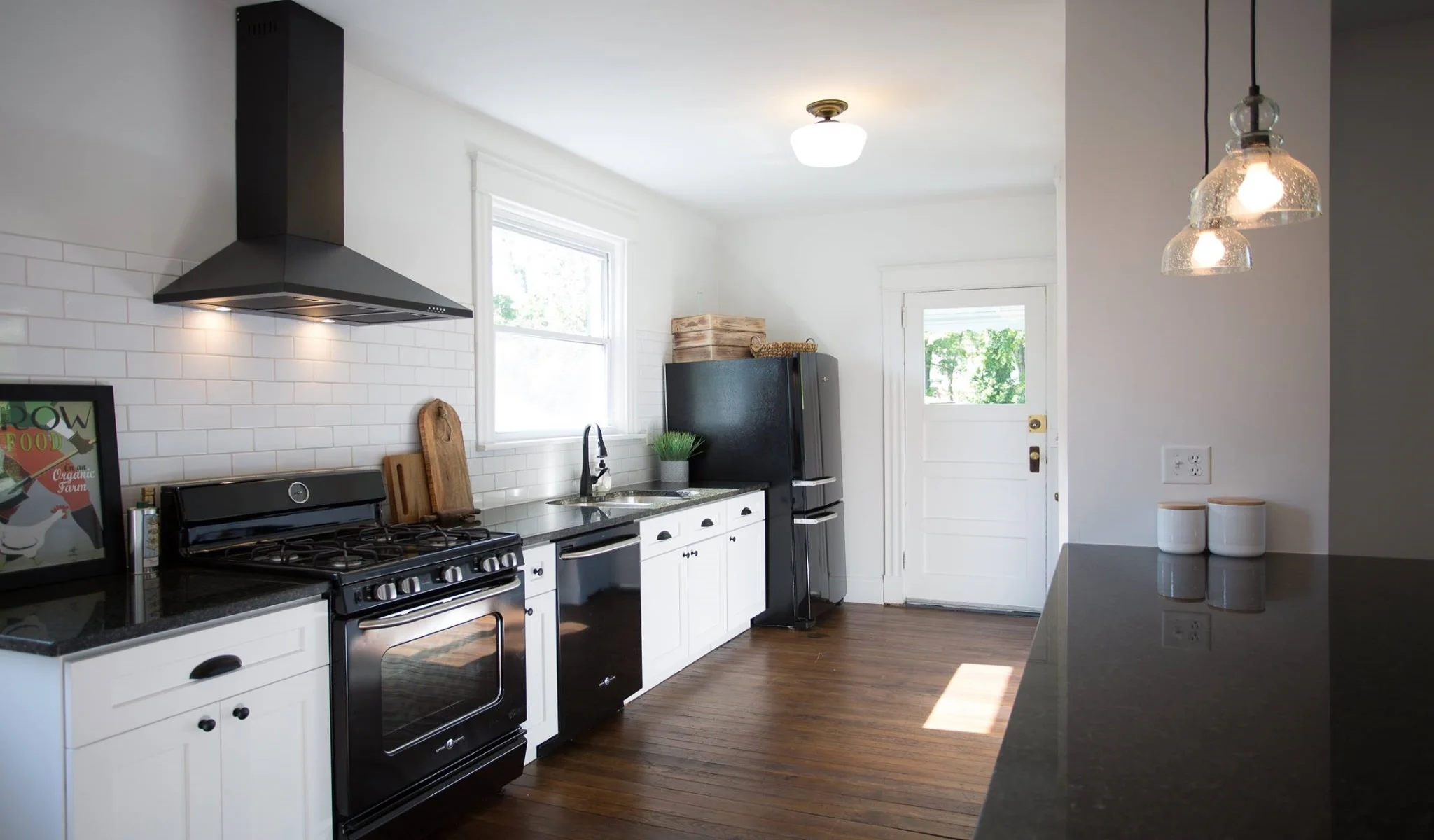
A black and white kitchen fits a variety of design styles. It's classic, traditional, but also very modern depending on how you accessorize. The matte black range hood and faucet gives this kitchen some modern flair. Thanks to the warm wood floors and just a few accessories to bring in some color and warmth (wood crates, cutting boards, plants), what would otherwise feel boring or "cold" looks warm and inviting. Simple subway tile with light grey grout blends with the bright white walls. We chose retro-style black appliances by GE, black granite countertops, and matte black knobs and pulls in classic shapes, another modern trend that also fits this classic styling.
Fun Tile + Brass + Grey
In this kitchen we went bold and graphic with a patterned backsplash tile. Notice how everything else in the kitchen is simple: Appliances are white to blend with the white cabinetry, walls are light grey (Sherwin Williams Nebulous White), tile is medium grey and countertops are marble (grey/white) so your eye isn't bothered by too many different colors or distractions. The backsplash really is the star of the show, but there are plenty of other surprises, from the retro-cool appliances to the mod white range hood. We added trendy brass accents for the knobs, pulls, faucet and pendant light. If brass falls out of fashion, this kitchen could get a simple facelift just by changing out those few details! Industrial wood shelves add some interest and warmth to the space and give the kitchen a custom look that stands out from the competition.
There you have it: four completely unique and different ways to use simple white cabinetry that are fun, interesting and will stand the test of time. Check out our Portfolio page to see more angles and details of all of the kitchens pictured here.


